
 The FCC recently released its Internet Access Services report for December 31, 2024. The report is generated to provide a mandated update to Congress annually on the state of broadband. The data for the report mostly comes from broadband data that ISPs report to the FCC twice each year using the BDC reporting system, with some overlay with Census data.
I’ve always hoped this report would provide useful information, but it’s challenging to glean any truly valuable information from the report. There are a lot of reasons that combine to make most of the report unusable.
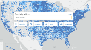
- There is still a lot of inconsistency in the way the FCC broadband map defines serviceable locations. There are numerous examples where the FCC maps include locations that don’t exist while excluding valid locations. There is still no consensus on how to count vacant homes, vacation cabins, apartments built in basements and garages, etc. The FCC broadband map concentrates on ‘mass-market’ residential and business broadband locations. This leads to inconsistent counting of large businesses, while most anchor institutions are not included in the map.
- ISPs report broadband coverage to the FCC, which is supposed to mean locations an ISP is connected to or that it can connect within 10 business days of a customer request for service. We’ve seen many cases where ISPs exaggerate claimed service areas.
- The real issue with the claimed coverage is that ISPs also claim the maximum broadband speed available at each location. FCC rules allow ISPs to claim marketing speeds, which may be very different than actual speeds. For example, it’s very common for ISPs to claim 100/20 Mbps coverage but deliver something much slower for download or upload speeds. This means the FCC report is nothing more than a summary of the marketing speeds claimed by ISPs.
- The FCC makes no attempt to layer on known changes to the data. For example, the FCC maintains maps of federal broadband grant awards that are supposed to be built in coming years. The report would be a lot more useful for measuring broadband improvements if there were tables summarizing these known changes.
- Finally, I’m doubtful, in today’s dynamic market, of the usefulness of any data captured at a snap shot in time. The Fiber Broadband Association claims there were 11.1 million fiber passings constructed during 2025 that are not reflected in the report. There have also been a lot of technology upgrades from cable companies, WISPs, and FWA providers. These changes all mean that the broadband landscape is significantly different just one year after the date of this report.
The report is full of charts and tables that sound like they should be useful, until you look at each of them in light of the above issues. For example, every table that is based on broadband speed is highly questionable due to ISPs that self-report marketing speeds.
But even many of the tables and graphs that don’t refer to speeds are puzzling, or report nothing useful.
- Figure 4 purports to show broadband customers at the end of 2024 by technology. It shows 57.3% on cable, 26.7% on fiber, 6.6% on DSL, 7.3 % on fixed wireless, and 2% on satellite. However, even this simple table is troublesome. The three big FWA cellular providers claimed 11.6 million customers at the end of 2024, and it looks like these customers are not included in any of the categories.
- Figure 9 shows the locations in each state with various speeds. Are there really 9% of locations in West Virginia and 5% of locations in Mississippi that can’t get a broadband speed of at least 0.2 Mbps? There are a lot of tables that analyze speeds over and under 200 kbps (this really is kilobits, which is four times faster than dial-up), which must be an obsolete Congressional reporting category.
- Figure 17 shows all fixed connections with speeds over 200 kbps. The table combines cellphones and broadband in the same table, which demonstrates that only 14% of broadband connections are from cable broadband.
- Figures 20 through 31 show the trend over time of the number of connections at various speeds. Because of the use of marketing speeds, the quantities are likely far off, but the trends are interesting. These figures clearly ignore FWA cellular broadband.
- There are a lot of charts and tables about cellular speeds, which are completely worthless since most cell companies report 5G speeds to the FCC maps of either 7/1 Mbps or 35/3 Mbps, in a world where actual speeds can be hundreds of Mbps.
- Figure 41 is interesting and shows the number of ISPs that report the use of various technologies over time. The trends are interesting but have no context. For example, how much of the drop of the number of cable ISPs is due to companies that folded versus those that were absorbed into a larger cable provider?